SOM
SKIDMORE, OWINGS & MERRILL | Architecture Firm
Complete website redesign and development

SOM is a world famous architecture firm that had fallen slightly behind in their web presence and wanted to update their web experience to match their technologically advanced architecture and skill.
My team was small but senior - we had a Sr Experience Strategist (also the DRI), a Developer, Sr UX Designer (me), Product Manager, and 2 Sr Visual Designers. We worked closely and iteratively internally, and together with the SOM stakeholders.
Process

Analysis: The first thing I do as a User Experience Designer on a new project is do a competitive analysis. Looking at the in-category landscape helps give me an idea of how the competition stacks up to their existing site, and who is doing the best in class to which we can aspire. I also do an out-of-category analysis to see what type of innovation or inspiration we can take from well-made sites. In the analysis I also look at how other competitors are structuring their sites, how they think about their site visitors and what they are putting at the top of page for their visitors.
Existing Content: As we comb through their site, we catalog the defining content types and develop a controlled vocabulary. As we start to create a new site structure to align with those content types the users motives and needs are balanced with the needs of the organization. For example, Project was defined as a content type which supports many site visitors who are looking for Projects, and helps path users, as content types are easily searchable and dynamically pulled into recirculation modules. Identifying the right content types helps with the editorial burden by automating as much of the page population as possible.
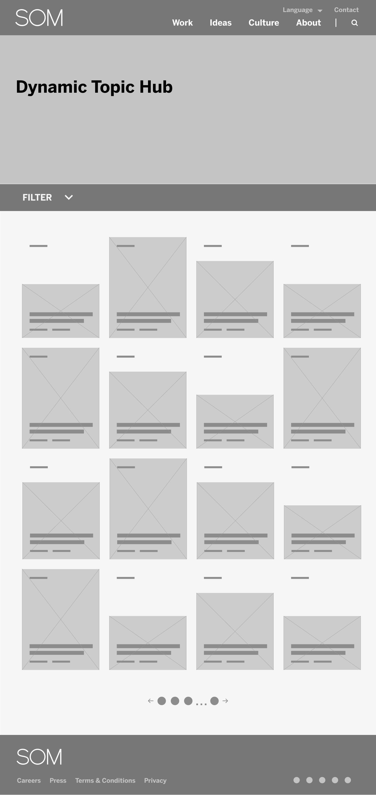
Modular Systems: The example on the left and directly below are simplified wireframes for the Homepage and other pages of the newly determined site structure to show the modularity. Modular designs reuse page templates (think of it as a lego kit guide) and components (the legos) to create consistency in user experience and efficiencies in development. They can be made to have variations (legos of the same shape may have different colors) and optional elements so that their visual impact can be adjusted based on the purpose of the component on any given page. While the simplified wireframe step is sometimes skipped, it has value in large site redesigns where a modular system’s logic is important to define early and adhere to along the way.
KPIs per Page + Feature: Each page has a unique purpose that is well-defined. We proposed specific KPIs for each page. For example, on the Homepage we wanted to track the unique page views, bounce rates, average time on page, and scroll depth. This is data that is set to be collected in development, and will be tracked over time for interpretation of user behavior.
Flexible templates:
To further create efficiencies, creating as few pages templates as possible is paramount. In the end, we defined 4 template types, one with a left rail, one with a right rail, and one with a centered alignment, and one we called a story template with a narrowed center grid. For development, each component is tagged with the template within which it can be used.
Purpose-built components:
By fully understanding the site and its purpose, we could start to imagine the components we would need to achieve the strategic goals of the site. The strategies for modules were 1) to path users through the site in a taxonomical way 2) express the company vision as needed 3) show overlap of content types 4) keep the user engaged and visually interested.


Refining into wireframes
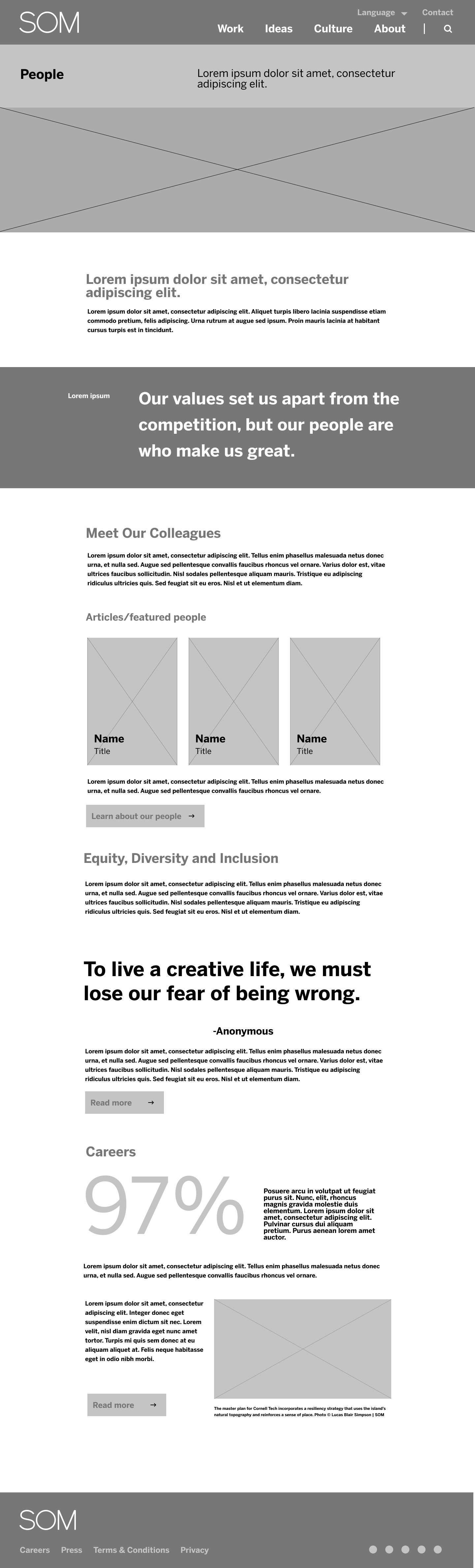
After working with the client to confirm the strategy and content types were appropriate, I create higher fidelity wireframes using their existing content and a fair amount of “lorem ipsum” to help convey the purpose and narrative of the page, and the features or states of complex components. It’s at this time that I usually develop the primary navigation menu(s) as well. Giving the client visual references where they can see pages filled with familiar content, as well as understand how the user would navigate around within and between pages is generally a useful and clarifying exercise. The client often has insights, so getting their eyes on the early wireframes is a meaningful part of the process.


Cool features worth talking about
To create a website design that feels totally unique, with a clear page and structural hierarchy, we needed to think about how to use the templates and modules to create a unique page experience. This is how we created endless unique pages in a TLDR; work smarter and not harder! By using a few unique templates and developing a modular structure with maximizing editorial flexibility: Modules that can flex between a rail and a centered template, allowing the editor to choose right and left bleed modules, to define sections with alternating color backgrounds, select rich text and wysiwyg for H1, H2, H3 text to allow for modules to stack as close as needed. One of the special aspects of working with an architecture firm is that there is a particular focus on images. We also worked closely with SOM to create modules that can use a wide range of aspect ratios to use their existing library of media, and to hero their super tall buildings.
For interesting page functionality, I’ll nerd out here and go into the specific functionality details of the Project Page.
Final_final View of Iterative Design
Once again, with the dedicated cooperation of the stakeholders at SOM and many iterations the team is currently developing these final, hard fought, designs. Click to view in lightbox.
